CSS Flexbox - Overview
What is Flexbox?
• A CSS3 layout mode that provides and easy and clean way to arrange items within a container
• No floats!
• Responsive and mobile friendly
• Positioning child elements is MUCH easier
• Flex container's margin do not collapse with the margins of its content
• Order of elements can be easily changed without editing the source HTML
~~~~~~~~~~~~~~~~~~~~~~~~~~~~~~~~~
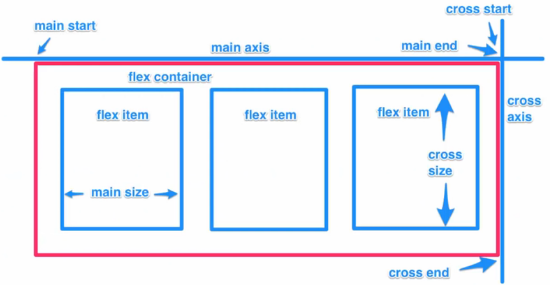
Flexible Box Model Concept
• The ability to alter item width and height to best fit in its containers available free space
• Flexbox is direction-agnostic
• Built for small-scale layouts while the upcoming “Grid” specification is for more large scale
~~~~~~~~~~~~~~~~~~~~~~~~~~~~~~~~~
Main Flex Properties
| Properties | Values | Notes | Screenshot |
|---|
| display | flex | inline-flex | Put elements in a class to a flexbox | |
| flex-direction | row | column | Display elements vertically or horizontally | |
| flex-wrap | wrap | no warp | wrapreverse | | |
| flex-basis | <length> | Specify width of element in % of the container | |
| justify-content | flex-start | flex-end | center | align left (default) | right | center | |
| space-between | space-around | | Y |
| align-self | flex-start | flex-end | center | | |
| align-items | flex-start | flex-end | center | default: align-items: <stretch> | |
| align-content | flex-start | flex-end | center | | |
| flex-grow | <number> | | |
| flex-shrink | <number> | | |
| flex | <integer> | define relative size (base=1) of elements | |
| order | <integer> | change order of elements | |
~~~~~~~~~~~~~~~~~~~~~~~~~~~~~~~~~
Display Elements Side by Side
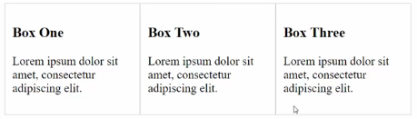
/* Display elements side by side */
.container-1{
display:flex; /* Put elements in a class to a flexbox */
}
~~~~~~~~~~~~~~~~~~~~~~~~~~~~~~~~~
Display Elements Vertically
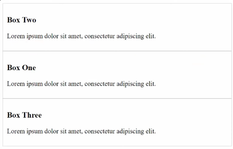
/* Display elements vertically */
.container-1{
display:flex;
flex-direction:column;
}
~~~~~~~~~~~~~~~~~~~~~~~~~~~~~~~~~
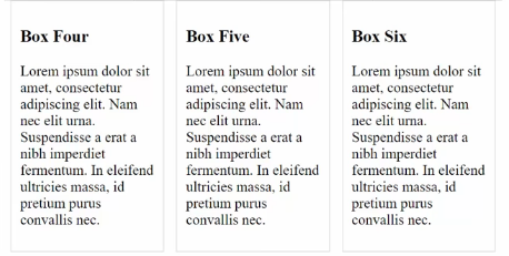
Display Elements Evenly

/* Display Element Evenly */
.box-1{
flex:1;
}
.box-2{
flex:1;
}
.box-3{
flex:1;
}
~~~~~~~~~~~~~~~~~~~~~~~~~~~~~~~~~
Display Elements in Proportion
/* Display Element in Proportion */
.box-1{
flex:2;
}
.box-2{
flex:1;
}
.box-3{
flex:1;
}
~~~~~~~~~~~~~~~~~~~~~~~~~~~~~~~~~
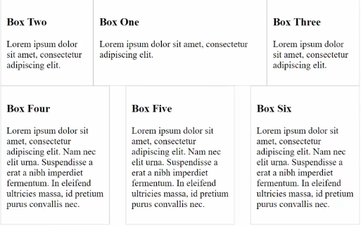
Change Order of Display
/* Change order of display */
.box-1{
flex:2;
order:2;
}
.box-2{
flex:1;
order:1;
}
.box-3{
flex:1;
order: 3;
}
~~~~~~~~~~~~~~~~~~~~~~~~~~~~~~~~~
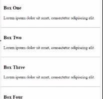
Change the Height
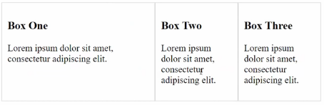
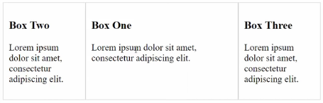
• By default, all elements within a container are of the same height
• To override this, use align-items: flex-start
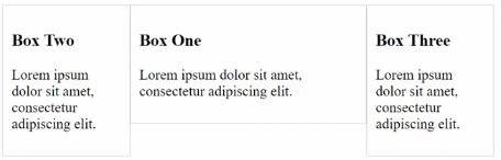
• As shown above, Box One is much shorter because it has less content
/* Change the Height*/
.container-1{
display:flex;
align-items:flex-start; /* move towards the top */
/* align-items:flex-end; */ /* move towards the bottom */
/* align-items:center; */ /* move towards the center */
}
~~~~~~~~~~~~~~~~~~~~~~~~~~~~~~~~~
Specify Margins and Widths
• Create another class .container-2 and put its elements in a flexbox
.container-2{
display:flex;
}
/* Specify width */
.container-2-box{
width: 20%;
/* or */
flex-basis: 20%;
}
~~~~~~~~~~~~~~~~~~~~~~~~~~~~~~~~~
Align Elements Within a Container
• justify-content: space-between: Put margins between elements so they can spread across
• justify-content: space-around: Put margins on the side as well
/* Align elements evenly within the container */
.container-2{
display:flex;
justify-content:space-between;
/* justify-content:flex-start; */ /* align left (default)*/
/* justify-content:flex-end; */ /* align right */
/* justify-content:center; */ /* align center */
}
.container-2-box{
width: 20%;
}
~~~~~~~~~~~~~~~~~~~~~~~~~~~~~~~~~
Set Minimum Width to Display Columns
• On small screen, we don't want flexbox to diplay too many columns
• For example, we don't want to have a 3-column layout on a smartphone
• We can use media query to achieve that. Below the specified width, all column displays will change to vertically display
/* Set minimum width to display columns */
@media(min-width:468px){
/* Put containers 1 and 2 inside */
}
~~~~~~~~~~~~~~~~~~~~~~~~~~~~~~~~~
Wrap
• Add container-3 with 6 boxes for demo purose
/* Add container-3 */
.container-1 div, .container-2 div, .container-3 div{
border:1px #ccc solid;
padding:10px;
}
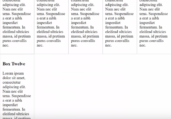
• If we narrow the window, at a certain point, some elements will move to the next line
/* Set wrap */
.container-3{
display:flex;
flex-wrap:wrap;
justify-content:space-between; /* add margin */
}
.container-3-box{
flex-basis:12%; /* set width */
}
 Index
Index