CSS Basics
• NOT covering flexbox, animation etc.
What is CSS?
• CSS stands for Cascading Style Sheets
• Used for website layout and design
• Can be extended with Sass / Less
~~~~~~~~~~~~~~~~~~~~~~~~~~~~~~~~~
3 Methods for Adding CSS
1. Inline CSS: Directly in the HTML element (NO!)
<!-- Inline CSS -->
<h1 style="color:red">Hello World</h1>
2. Internal CSS: Using <sytle> tags within a single document inside <head> tag
<!-- Internal CSS -->
<style type="text/css">
h1{
color:blue;
}
</style>
3. External CSS: Linking an external .css file (recommended)
<!-- External CSS-->
<!-- File: css/style.css -->
h1{
color:green;
}
<!-- External CSS -->
<!-- In HTML file header -->
<head>
<link rel="stylesheet" type="text/css" href="css/style.css">
</head>
~~~~~~~~~~~~~~~~~~~~~~~~~~~~~~~~~
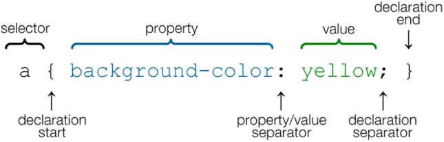
CSS Selectors
Syntax
~~~~~~~~~~~~~~~~~~~~~~~~~~~~~~~~~
Colors
• We can use the following for colors in CSS:
◇ Color names
◇ HTML5 color names
◇ Hexadecimal
◇ RGB values
/* Color names */
body{
color:red;
background:coral; /* HTML5 color name */
}
/* Hexadecimal */
h1{
color: #00ff00;
}
body{
background-color:#f4f4f4; /* Lihgt Gray */
color:#555555; /* Dark Gray */
}
/* RGB values */
p{
color: rgb(0, 0, 255);
}
~~~~~~~~~~~~~~~~~~~~~~~~~~~~~~~~~
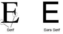
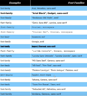
Fonts
• You can use web safe fonts or custom fonts like Google fonts
• If you don't specify any fonts to use, “Times New Roman” will be the default
/* Fonts */
body{
font-family: Arial, Helvetica, sans-serif;
font-size:16px;
font-weight:normal; /* normal (default)/ bold/ 400 */
}
/* or */
body{
font: normal 16px Arial, Helvetica, sans-serif;
}
~~~~~~~~~~~~~~~~~~~~~~~~~~~~~~~~~
Line Height
• Add more space between the lines
/* Line Height */
body{
line-height:1.6em; /* units: em/ px */
}
~~~~~~~~~~~~~~~~~~~~~~~~~~~~~~~~~
Class vs. ID
• If you want to make an element unique, use <id> tag in .html file
• If you want to reuse some styling to other elements, use <class> tag in .html file
• In CSS, class is preceded with a dot like .classname
• In CSS, id is preceded with a # like #id_name
~~~~~~~~~~~~~~~~~~~~~~~~~~~~~~~~~
Container
• If you don't want the elements to be pushed to the edge of a web page, define a class called “container” and use it to wrap around everything inside the html <body>
• To make the web page responsive, set the width of the container to percent
• To center the element, use margin: auto
/* Container Class */
.container{
/* Set the width to percentage instead of pixel (px) to make the page responseive */
width:80%;
/* Set left & right margins the same (Center) */
margin:auto;
}
<!-- In .html file -->
<body>
<div class="container">
</div> <!-- end of container -->
</body>
~~~~~~~~~~~~~~~~~~~~~~~~~~~~~~~~~
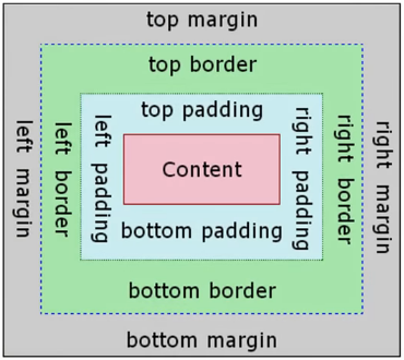
Margin, Border and Padding
• CSS use the Box Model to handle margin and padding of an element
Margin Style and Shorthand
• To Push Everything Up at the bottom of the page:
<!-- Add to the bottom of the page to push everything up a little bit -->
<div style="margin-top:500px;"></div>
</body>
/* Margin & Padding Shorthand */
p{
margin-top:5px;
margin-bottom:5px;
margin-right:10px;
margin-left:10px;
}
/* or */
p{
margin:5px 10px 5px 10px; /* top right bottom left */
}
/* or */
p{
margin:5px 10px; /* top-bottom right-left */
}
Border Styles and Shorthand
border-radius:15 px; /* round corners */
/* Border Shorthand */
/* Can be in any order */
border-width: 5px;
border-color: red;
border-style: solid; /* dotted */
/* or */
border: 5px red solid;
Padding Styles and Shorthand
/* Padding Shorthand */
.box-1{
padding-top:20px;
padding-bottom:20px;
padding-right:20px;
padding-left:20px;
}
/* or */
.box-1{
padding:20px;
}
Reset All Margins and Paddings
• Some elements like <h1> <p> <ul> have padding by default. If you want to zero out all margin and padding on all elements
/* Reset margin & padding of all elements */
*{
margin:0;
padding:0;
}
~~~~~~~~~~~~~~~~~~~~~~~~~~~~~~~~~
Text Formatting Style
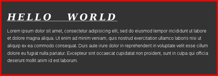
/* Text formatting style */
.box-1 h1{
font-family:Tahoma;
font-weight:800;
font-style:italic;
text-align:center;
text-decoration:underline;
text-transform:uppercase;
letter-spacing: 0.2em;
word-spacing: 1em;
}
~~~~~~~~~~~~~~~~~~~~~~~~~~~~~~~~~
List <ul> and List Items <li> Sytles
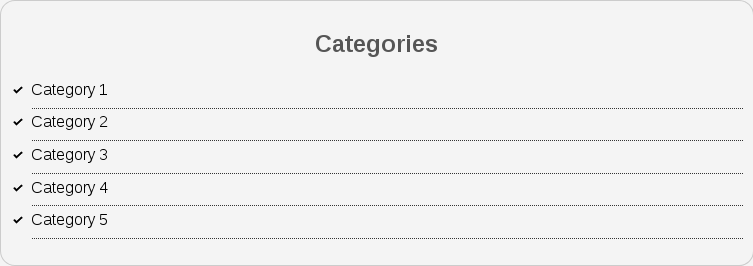
• You can do the styling either on <ul> or <li>. It's a personal preference
<!-- html file -->
<div class="categories">
<h2>Categories</h2>
<ul>
<li><a href="#">Category 1</a></li>
<li><a href="#">Category 2</a></li>
<li><a href="#">Category 3</a></li>
<li><a href="#">Category 4</a></li>
<li><a href="test.html">Category 5</a></li>
</ul>
</div>
/* ul */
.categories ul{
padding:0; /* overwrite default padding */
padding-left:20px;
list-style:square; /* change bullet points */
list-style:none; /* no bullet points */
}
/* List Item */
.categories li{
padding-bottom:6px;
border-bottom:dotted 1px #333;
/* Use custom image */
list-style-image: url('../images/check.png');
}
~~~~~~~~~~~~~~~~~~~~~~~~~~~~~~~~~
Hyerlinks
• Hyperlinks have different states like hover, active, visited
/* Hyperlinks */
a{
text-decoration: none; /* get rid of the underline */
color:#000;
}
a:hover{
color:red;
}
a:active{
color:green; /* when you click on it */
}
a:visited{
}
~~~~~~~~~~~~~~~~~~~~~~~~~~~~~~~~~
Forms
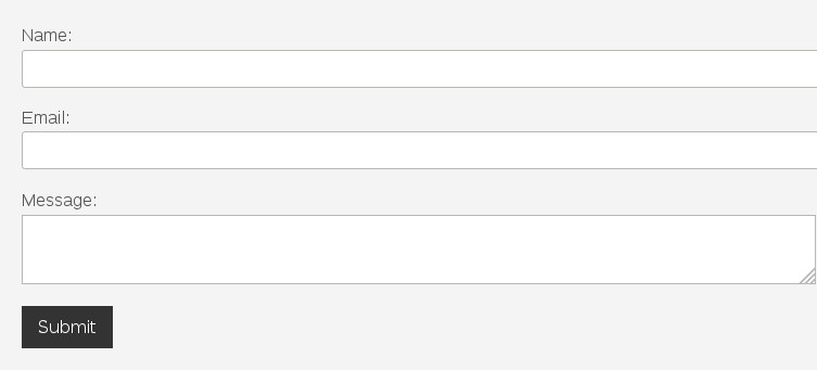
• To make the default form looks better ...
<!-- .html file -->
<!-- Inside <body><div class="container"> -->
<form class="my-form">
<div class="form-group">
<label>Name: </label>
<input type="text" name="name">
</div>
<div class="form-group">
<label>Email: </label>
<input type="text" name="email">
</div>
<div class="form-group">
<label>Message: </label>
<textarea name="message"></textarea>
</div>
<input class="button" type="submit" value="Submit" name="">
</form>
• Like hyperlink, a button can have different states like hover
/* Form */
.button{
background-color:#333;
color:#fff;
padding:10px 15px;
border:none;
}
.button:hover{ /* hover effect */
background:red;
color:#fff;
}
.my-form{
padding:20px;
}
.my-form .form-group{
padding-bottom:15px;
}
.my-form label{
display:block; /* Put labels on their own lines */
}
.my-form input[type="text"], .my-form textarea{
padding:8px;
width:100%; /* 100% of the container */
}
~~~~~~~~~~~~~~~~~~~~~~~~~~~~~~~~~
Alignment and Floating
Display text blocks in columns
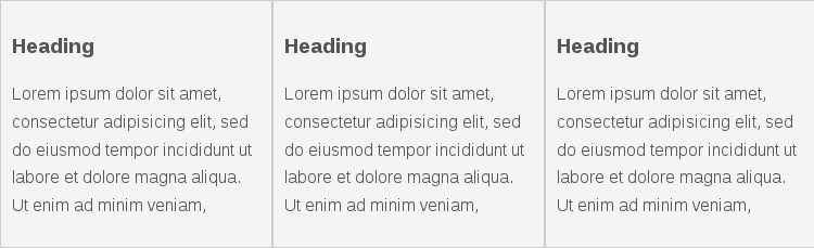
<!-- .html file -->
<!-- 3 blocks of paragraphs -->
<div class="block">
<h3>Heading</h3>
<p>Lorem ipsum dolor sit amet, consectetur adipisicing elit, sed do eiusmod empor incididunt ut labore et dolore magna aliqua. Ut enim ad minim veniam,
</p>
</div>
<div class="block">
<h3>Heading</h3>
<p>Lorem ipsum dolor sit amet, consectetur adipisicing elit, sed do eiusmod tempor incididunt ut labore et dolore magna aliqua. Ut enim ad minim veniam,
</p>
</div>
<div class="block">
<h3>Heading</h3>
<p>Lorem ipsum dolor sit amet, consectetur adipisicing elit, sed do eiusmod tempor incididunt ut labore et dolore magna aliqua. Ut enim ad minim veniam,
</p>
</div>
/* Display text blocks in columns */
.block{
float:left;
width:33.3%; /* for 3 blcoks of text */
border:1px solid #ccc;
padding:10px;
/* Takes in border and padding and apply them to width calculation */
box-sizing:border-box;
}
• CSS Flexbox takes care of the above and can do much more
Reset Floating Style
<!-- .html file -->
<!-- Reset floating style -->
<!-- Put the <div> below the text block <div class="block"> -->
<div class="clr"></div>
/* Reset the float sytle */
.clr{
clear:both;
}
Create Sidebar
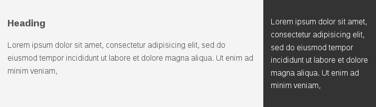
<!-- .html file -->
<!-- Create Sidebar -->
<!-- Put the following elements after <div class="clr"> -->
<div id="main-block">
<h3>Heading</h3>
<p>Lorem ipsum dolor sit amet, consectetur adipisicing elit, sed do eiusmod tempor incididunt ut labore et dolore magna aliqua. Ut enim ad minim veniam,
</p>
</div>
<div id="sidebar">
<p>Lorem ipsum dolor sit amet, consectetur adipisicing elit, sed do eiusmod tempor incididunt ut labore et dolore magna aliqua. Ut enim ad minim veniam,
</p>
</div>
/* ID for sidebar */
#main-block{
float:left;
width:70%; /* Use percent to make page responsive*/
padding:15px;
box-sizing: border-box; /* align the float with sidebar */
}
#sidebar{
float:right;
width:30%;
background-color:#333;
color:#fff;
padding:15px;
box-sizing: border-box; /* align the float with main-block */
}
~~~~~~~~~~~~~~~~~~~~~~~~~~~~~~~~~
Positioning in CSS
• Static (default):
• Relative
• Absolute
• Fixed
• Initial
• Inherit
| Position | Description |
|---|
| Static | Default; Renders the elements in order of document flow |
| Relative | Position the element in normal position with additional properties
(top, bottom, left, right) |
| Absolute | Position the target in whatever position we want inside of a relative element |
| Fixed | Remain in same position to the browser window no matter how we scroll |
| Initial | Position at its default value |
| Inherit | Inherit properties of its parent element |
<!-- .html file -->
<!-- Positioning -->
<div class="p-box">
<h1>Hello</h1>
<h2>Goodbye</h2>
</div>
We can put the stuff wherever we want
/* Positioning */
.p-box{
width:800px;
height:500px;
border:1px solid #000;
margin-top:30px;
/* Set to "relative" so position of h1 and h2 be aligned with element .p-box. Without this line, h1 and h2 will be positioned from top of the container */
position:relative;
}
.p-box h1{
position:absolute; /* position relative to .p-box */
top:100px;
left:200px;
}
.p-box h2{
position:absolute; /* position relative to .p-box */
bottom:40px;
right:100px;
}
Fixed Positioning
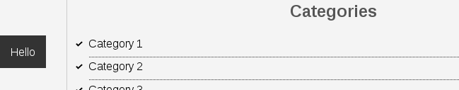
• Wherever we scroll, the element “Hello” will be there
• Good to use if you want the users to always see it e.g. back to top, navbar, toc etc.
<!-- .html file -->
<!-- Fixed Positioning -->
<!-- Put the following line outside the class container but before </body>-->
<a class="fix-me button" href="">Hello</a>
/* Fixed Poistioning */
.fix-me{
position:fixed;
top:400px; /* from the top of the browser */
}
~~~~~~~~~~~~~~~~~~~~~~~~~~~~~~~~~
Use Image as Element Background
/* Use image as element background */
.p-box{
background-image:url('../images/bgimage.jpg');
background-repeat: no-repeat;
background-position:100px 200px;
background-position:center top; /* center center */
}
~~~~~~~~~~~~~~~~~~~~~~~~~~~~~~~~~
Pseudo Classes
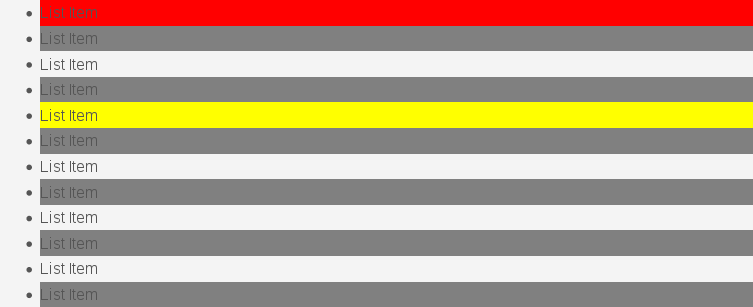
• We can use Pseudo Classes to target an element
• Specify a pseudo class with a colon .myclass:pseudo_class
<!-- .html file -->
<ul class="my-list">
<li>List Item</li>
<li>List Item</li>
<li>List Item</li>
<li>List Item</li>
<li>List Item</li>
<li>List Item</li>
<li>List Item</li>
<li>List Item</li>
<li>List Item</li>
<li>List Item</li>
<li>List Item</li>
<li>List Item</li>
</ul>
/* Pseudo Classes */
.my-list li:first-child{
background: red;
}
.my-list li:last-child{
background: blue;
}
.my-list li:nth-child(5){
background: yellow;
}
.my-list li:nth-child(even){
background: grey;
}
 Index
Index