Tips for Building Charts
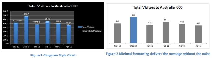
Less is More - KISS
• Minimize use of formatting delivers the message without the noise
• If you have multiple messages, consider building multiple charts or making the charts dynamic so the user can choose the view
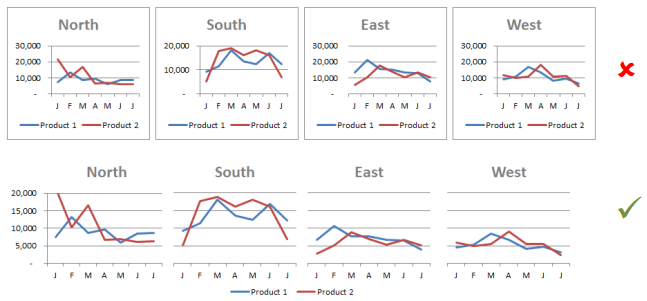
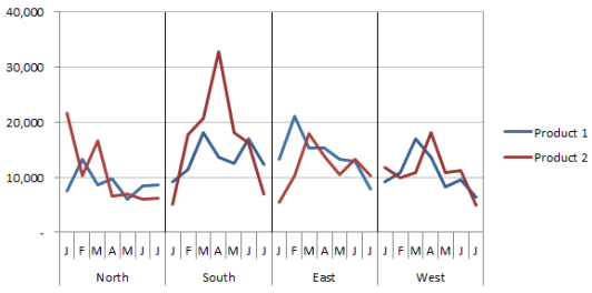
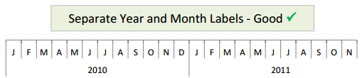
• Label the chart once if they use the same labels. Alternatively, use a panel chart
~~~~~~~~~~~~~~~~~~~~~~~~~~~~~~~~~
Know Your Audience
• A chart isn't always the best method of communications, sometimes a table is better, especially when the information needs to be precise
~~~~~~~~~~~~~~~~~~~~~~~~~~~~~~~~~
Formatting
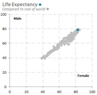
• Link related data with common colors
• If in doubt, use shades of grey
• Consider a label for the lines on your Line chart instead of a legend
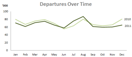
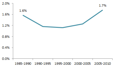
• Consider only labelling the first and/or last, or highest and lowest
• You don't need black borders around your charts
• You should bequeath the darkest colors to the most important information. Use lighter shades for chart title, axis labels and gridlines
• Limit the number of fonts to 2 or less. Good fonts to use are Calibri, Tashoma, Verdana, Helvetica
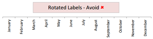
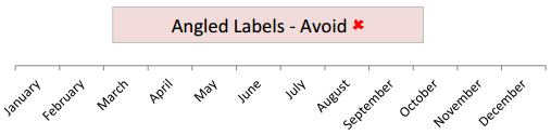
• Don't make people turn their heads to read the axis labels. For example abbreviate months to J, F, M, A etc.
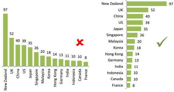
• For nominal categories like department names, regions etc. change it to a bar chart so they can be easily read
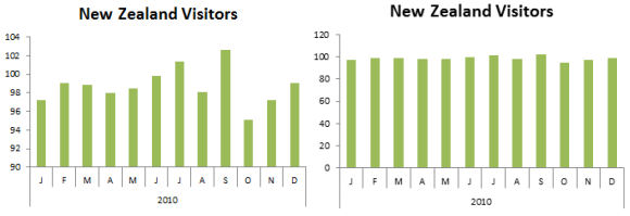
• Bar and column chart axis should always include zero
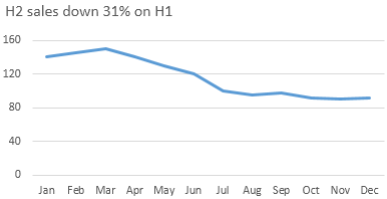
• Chart titles don't have to be boring. Use them to make a statement about the results in the chart
 Index
Index