| Message | Chart | Remarks |
|---|
| Nominal Comparison | Column or Bar charts | |
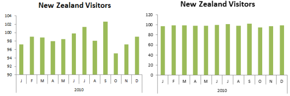
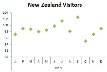
| Time Series | Line or Bar or Dot or Step charts | Lines focus on the overall pattern
Bars focus on individual values
Dots - best of both worlds
Step - Useful for displaying how the levels in your data increase, remain constant or decrease over time |
| Ranking | Bar or in-cell or Sparklines Charts | |
| Parts to a Whole | Bar or Column or Bullet charts
Stacked Bars (occasionally) | Only use Pies if there are <= 3 items / segments |
| Deviation or Variance | Column or Bar or Line charts | When your target is a range, you can use a line or column chart compared to a range or tolerance |
| Distribution | Histogram | Box Plots (box and whisker chart) are another alternative but they're not as easily interpreted to the untrained user |
| Correlation | Scatter chart with a trend line | |